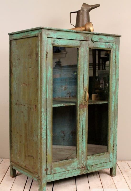
The cabinet in this image is extraordinary. A squat, glass-fronted display case painted in layers of green — darker underneath, lighter on top, with rust and bare wood showing at the edges where the paint has worn away. On top, a collection of aged brass oil cans and a watering can, placed without fuss. The whole thing sits on pale painted floorboards in a room with no other distractions. It needs nothing else.
What makes a distressed green cabinet work
Green is the most forgiving colour for antique and distressed furniture because it exists in so many variations — from warm olive to cool turquoise, from deep forest to chalky sage. The green in this cabinet is somewhere between teal and hunter: complex, layered, impossible to reproduce from a tin of paint. That's what makes it interesting.
The distressing — the chips, the wear at the corners, the visible layers — adds depth that a freshly painted piece simply cannot have. If you find a piece like this, resist the urge to restore it. The wear is the value.
How to evaluate a piece before you buy
When you find a distressed cabinet you're interested in, the physical inspection matters as much as the visual appeal. Check:
- The joints and structure: open the doors and press gently at the corners. Solid construction should have no flex. Old glue joints can often be re-glued; completely failed joints are a warning sign.
- The drawer runners: pull drawers out fully. Sticking or failing runners are repairable but add cost. Smooth, well-fitted drawers with original wooden runners are a sign of quality construction.
- The glass: original old glass is often slightly wavy when you look through it at an angle. This imperfection is desirable and very difficult to replicate in modern glass.
- Signs of damp or rot: press gently on the lower sides and base. Any softness suggests water damage. A musty smell can indicate mould in the interior — inspect the shelves with a torch.
A piece that passes these checks is worth buying even if the paint surface looks rough. A piece that fails structural checks is a renovation project, not an antique purchase.
What to put inside a glass-fronted cabinet
A glass-fronted display case is a frame for whatever you choose to put in it. The best contents share a common thread — material, colour or purpose:
- Collections of ceramics in a consistent tone (all cream, all terracotta, all earthenware)
- Books with beautiful spines, arranged by colour
- Vintage glassware — decanters, tumblers, apothecary jars
- Natural objects — dried botanicals, stones, shells, feathers
Leave some shelves partially empty. A display case crammed to capacity looks like a charity shop; one that's thoughtfully edited looks like a museum.
Colours that work alongside green vintage furniture
The green in an aged cabinet will rarely be a single, clean colour — it'll contain traces of brown, yellow or blue, depending on its history. The trick is to pick out one of those undertones and echo it in nearby objects rather than trying to match the green itself.
- Warm brass and copper pick up the yellow undertones in aged forest and olive greens, creating a warm metallic complement
- Terracotta and rust sit naturally with green across the whole spectrum — the combination has roots in traditional Mediterranean and Central European folk decoration
- Cream and off-white are the safest background colours: they let the green read clearly without competing
- Navy or indigo textiles (a rug, a cushion) work beautifully with teal-green cabinets in particular
Avoid primary red next to green — it creates an unintentional Christmas palette. And avoid grey, which can make aged green furniture look cold and unloved rather than characterful.
Styling the top surface
The brass oil cans on top of this cabinet are a masterstroke: they're functional objects repurposed as display, they're the same warm metallic tone, and their different heights create an informal composition. The same principle works with any collection of related objects placed on top of a statement piece.
The key word is collection. A single object on top of a tall cabinet looks forgotten. Three to five related objects — all brass, all ceramics, all garden implements — look curated. Group them tightly enough that they read as one arrangement, with varying heights to create visual rhythm.
Where to find pieces like this
Estate sales, specialist antique dealers, salvage yards and online auction platforms are the best sources for genuinely distressed pieces. Avoid reproduction vintage — the real thing is almost always cheaper than a well-made imitation and infinitely more interesting.
In the UK, look at Selby's Antiques, the LAPADA dealer network and regional salerooms. In Scandinavia, Tradera (the Swedish equivalent of eBay) often has remarkable pieces at low prices because the market for distressed antique furniture is smaller there. Internationally, Chairish and 1stDibs cover the premium end; Facebook Marketplace covers the bargain end.
Common mistakes when styling antique display cabinets
The most common mistake is placing an antique cabinet in a room that's too modern and too clean. A distressed cabinet needs some texture in its environment — a worn rug, bare plaster, unfinished shelves, aged books. Place it in a freshly renovated white room and it looks like a prop rather than a possession.
The second mistake is mixing too many eras inside the display. A curated collection is coherent: all Scandinavian folk pottery, or all Victorian apothecary glass. A mixed collection requires real curatorial skill. When in doubt, limit yourself to two categories at most.
Interior tips
- Place against a pale, textured wall — the cabinet needs a quiet background to stand out. A limewashed wall or bare plaster in off-white is ideal.
- Don't add other statement pieces nearby: let the cabinet be the room's focal point. Surrounding it with other bold objects dilutes its impact.
- Brass and copper accessories on nearby surfaces — a small lamp, a tray, a candlestick — pick up the warm metal tones of the objects on top.
- A single trailing plant on or beside the cabinet adds life without competing — ivy or a small pothos in a terracotta pot is enough.
- Polish the brass but leave the paint: the contrast between maintained metalware and worn furniture is part of the aesthetic.
Related posts

How to Frame a Doorway with Plants for a Stunning Kitchen View
Trailing plants on a shelf above a black-framed doorway, floor plants on either side, and a warm Scandi kitchen beyond — how to make a transition space the most beautiful part of your home.

The Hygge Living Room: Layering Textures, Candles and Natural Materials
Patterned cushions, chunky knit throws, wooden tray tables, candles and eucalyptus — how to build a living room that feels genuinely cosy all year round.
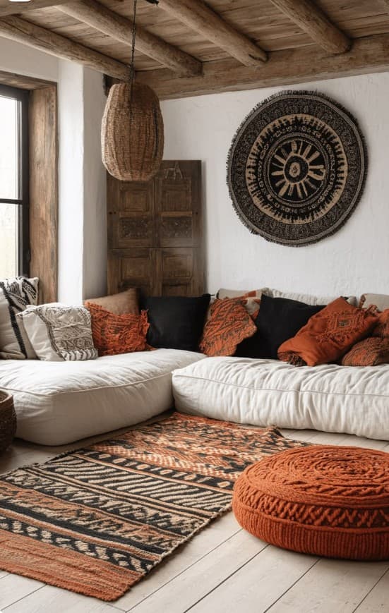
Rust, Black and White: The Boldest Boho Palette in One Living Room
A low white sectional sofa loaded with rust-orange ethnic cushions, a black circular wall tapestry, a bold kilim rug and a rattan pendant — this is boho living room design at its most confident and distinctive.