The Micro-Apartment Floor Plan: How 18 Square Metres Contains a Complete Home
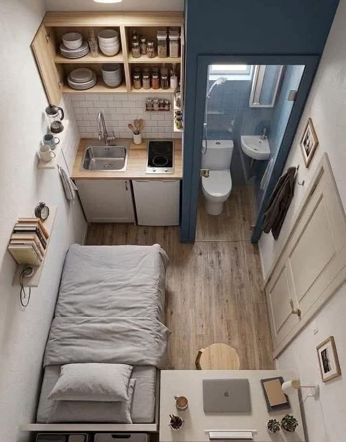
Viewed from directly above, this micro-apartment reveals every element of a complete home within approximately 18 square metres. Reading across from left to right: on the left, a single bed in light grey bedding, a small floating shelf with books beside it at head height, a small alarm clock. In the center: a narrow kitchen with a stainless sink, an induction cooktop and open shelving above holding plates, bowls and glass spice jars in neat rows. To the right of the kitchen: a blue-painted bathroom enclosure with a toilet, corner sink and shower visible through the open door. At the bottom of the image: a small work desk with a MacBook open, a coffee cup, a small plant and a framed art print on the wall. A small round wooden table is visible in the narrow space between the kitchen and bed. Framed photographs on the right wall. All surfaces and materials are in light oak, white and grey — the palette of an interior where no space can be wasted on visual noise.
Why the layout works
Every square metre here has exactly one function, and every function has exactly one location. The bed is against one wall with only enough floor space beside it to get in and out. The kitchen runs along the adjacent wall. The bathroom is enclosed in its own corner. The desk occupies the remaining corner, with natural light from a window above it. This zoning is not a design choice — it's a constraint that produces excellent design, because there is no room for inefficiency or redundancy.
Open shelving above the kitchen
The open shelving above the kitchen sink and hob holds everything that a kitchen needs without any of the overhead cabinet depth that would make the space feel lower and more enclosed. Plates are stacked visibly — you can see at a glance what you have. The glass spice jars in a row add the systematic quality of a professional kitchen at domestic scale. Open shelving in a micro-kitchen is not just aesthetic: it removes the need to open and close cabinet doors in a space where every movement counts.
The bathroom enclosure
The bathroom here is walled off in a distinctive blue — a colour decision that signals clearly "this is a different space" without requiring a full wall. The blue enclosure acts as a visual anchor on the right side of the apartment and prevents the bathroom's function from bleeding into the main living area visually. The corner placement is efficient: both the toilet and the sink use corner floor space, and the shower likely uses the remaining corner space within the enclosure.
The desk at the end
The work desk at the bottom of the apartment — a clean, slim surface with just a laptop and a mug — is positioned to face the room rather than a wall. This is an important distinction in a micro-apartment: a desk that faces the room makes the work zone feel connected to the space; a desk facing a wall feels like a punishment. The framed art nearby adds the single decorative note the workspace needs.
Interior tips
- Single colour for the bathroom enclosure: a strong colour on the bathroom wall (blue here) is one of the most effective ways to demarcate the bathroom in an open or semi-open layout without a full wall. It signals a zone change more clearly than any architectural detail could.
- Open shelving above a micro-kitchen keeps the visual height of the kitchen walls alive and prevents the overhead storage from pressing down on an already narrow space.
- A small round table between zones serves as both a dining table and a surface that can be pulled toward whichever zone needs it — kitchen prep, desk overflow, bedside reading. Round tables have no awkward corners in tight spaces.
- Keep all materials within the same pale palette: light oak, white, grey and cream. In a room this small, introducing a second material family (dark wood, pattern, colour) doubles the visual complexity. Monotonal is not boring here — it's essential.
- One framed art print per zone: one print by the desk, one by the bed. Not a gallery wall, not a cluster — one print per zone signals that the space is finished and intentional at its own scale.
Related posts

How to Style a Hallway with a Large Monstera and Uplighter
A statement monstera in a ribbed pot with an uplighter beneath it transforms a hallway into the most memorable part of your home. Here is how to do it well.
Three Walnut Shelves Above the Toilet: The Bathroom Storage Idea That Changes Everything
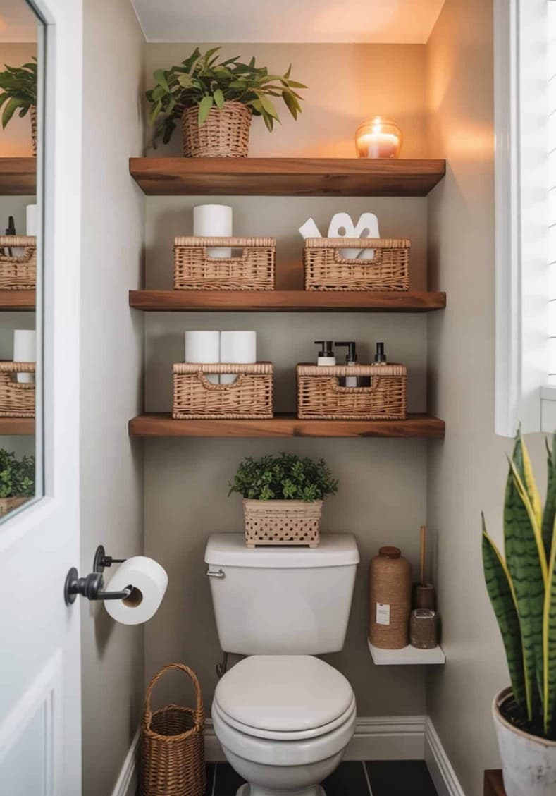
Three dark walnut floating shelves above the toilet, each holding wicker baskets with toiletries, a large plant, an amber candle and a snake plant on the floor — this is how to make a small bathroom look considered and beautiful.
The Plant Room Divider: How to Separate a Studio Bedroom Without Walls
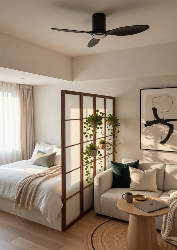
A wooden grid panel with hanging trailing plants creates a beautiful, light-filled boundary between sleeping and living zones — no construction required.