Floor-to-Ceiling Corner Bookshelves: The Most Dramatic Reading Nook Upgrade
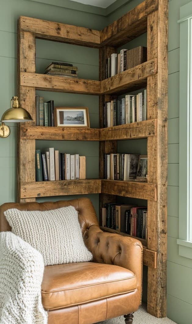
Two walls of a corner are covered, floor to ceiling, with open shelves built from wide reclaimed timber planks in heavy, rough-sawn frames. The shelves are full but not crammed — books spine-out, a framed photograph leaning against the spines, a small ceramic piece here and there, nothing decorative for its own sake. In the corner where the two shelf walls meet, a brown leather Chesterfield-style armchair sits with a cream chunky-knit cushion on the seat. A brass wall-mounted reading lamp curves down over the chair from the right. The wall behind is painted a deep sage green. This is what a reading corner looks like when it's taken seriously.
Why corner shelves are more impactful than a single wall
A bookshelf on one wall is furniture. A bookshelf on two walls is an environment. When shelves wrap around a corner, they enclose the reading space — you sit inside the collection rather than facing it from across the room. The psychological effect is significant: the chair feels like a destination, a room within a room, rather than simply a chair that happens to be near a bookshelf.
The reclaimed timber frame
The frames of these shelves are built from heavy, square-section timber — the kind used for scaffold poles or structural framing. The timber is rough and unfinished, with visible saw marks and grain variation. This is completely deliberate: the rawness of the material contrasts with the leather and the painted wall in a way that makes all three materials more vivid. Smooth, painted wood shelves against a sage green wall would look flat; rough reclaimed timber looks alive.
Shelf depth and spacing
These shelves are deep enough for standard books (around 25–28 cm) and spaced approximately 30–35 cm apart vertically — tall enough for art books and some decor items, not so tall that they require a library ladder to reach the top. The depth is consistent across all shelves, which gives the whole composition a grid-like regularity that makes the variation in shelf content — the books, the photo, the ceramics — feel deliberate rather than random.
The Chesterfield armchair
The leather Chesterfield here is a classic: button-tufted back and seat, rolled arms, turned wooden legs, warm tan leather that has clearly aged gracefully. It's the opposite of the reclaimed timber shelves in almost every way — refined, precise, historical — and yet the combination works precisely because of that contrast. The cream knit cushion softens the formality of the chair, bringing it back toward the warmth of the shelves.
The brass wall sconce
The brass reading lamp mounted to the right of the chair is the final element that makes this corner work. Overhead lighting in a reading nook is a mistake — it lights the ceiling, not the page. A wall-mounted sconce at head height, positioned so it casts light directly onto where your book will be, is the professional approach. Brass has warmth and age appropriate to both the leather chair and the rough timber.
Interior tips
- Paint the wall behind a dark shelf a deep, rich colour: sage green here makes the books stand out rather than disappear into the wall. Navy, forest green, deep charcoal or terracotta all work well behind a natural timber bookshelf.
- Leave one shelf empty: a fully packed bookshelf has no breathing room. One empty or near-empty shelf in the middle of the composition acts as visual punctuation and makes the collection feel curated rather than crammed.
- Lean rather than hang: a framed picture leaning against book spines is more casual, more personal and easier to change than one screwed to the shelf back. It also adds depth — the picture sits in front of the books rather than on them.
- Mix book sizes on each shelf: alternating between tall art books, standard-height paperbacks and small hardbacks creates a varied silhouette that is far more interesting than perfectly uniform spines.
- A reading lamp with a dimmer switch is not a luxury — it's a requirement. The difference between full brightness (for focused reading) and 30% brightness (for relaxed evening reading) is the difference between a pleasant space and an extraordinary one.
Related posts
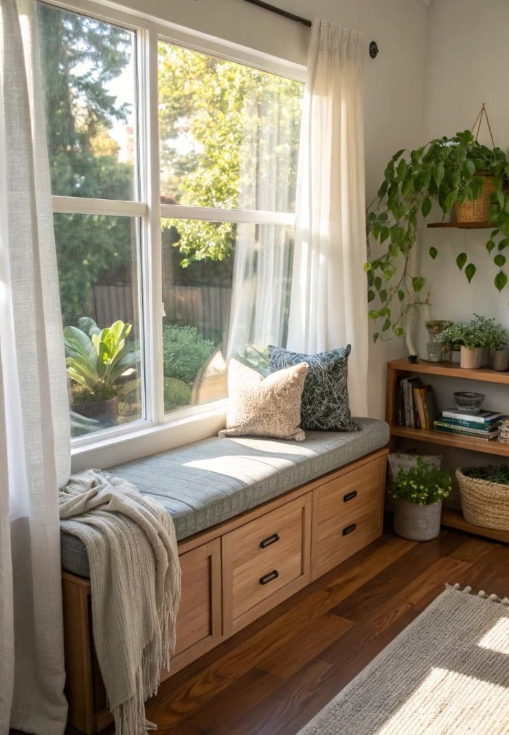
How to Build a Window Seat With Built-In Storage Drawers
A window seat with drawers underneath is one of the most rewarding home projects you can do — it adds seating, storage and a beautiful reading nook all at once.
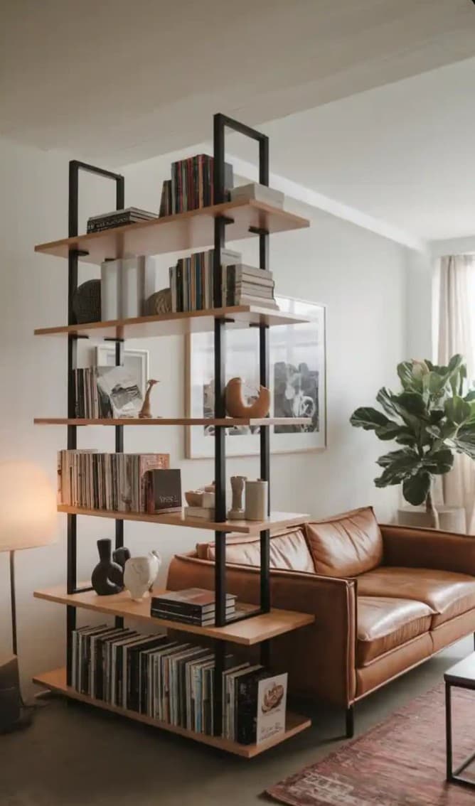
Industrial Shelving Units: The Statement Storage Piece for Modern Living Rooms
A tall black-frame, oak-shelf freestanding unit with books, ceramics and vinyl records becomes the focal point of a living room — here's how to style one.

Japandi Platform Sofa With Hidden Storage Drawers: The Ultimate Space-Saver
A low pine platform sofa with pull-out drawers underneath stores as much as a wardrobe while taking up the footprint of a sofa. Here's why this is one of the smartest furniture ideas around.